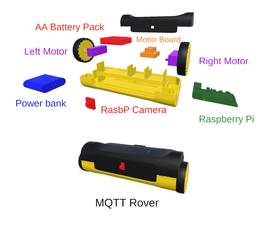
2 Wheel Robot Powered by MQTT & Node-RED
How I built a 2-wheel robot from scratch using Python & an Android app
Recently, I was working on a testing report for a company project, where I needed to visualize extensive data consisting of multiple data points with unique rows and columns. To better understand the data, I used different types of graphs, such as bar charts and linear graphs, using Matplotlib and Python.
When dealing with large datasets, it is challenging to understand the data without simple visualizations. Hence, I created this quick guide on how to set up various graphs using Matplotlib in Python.
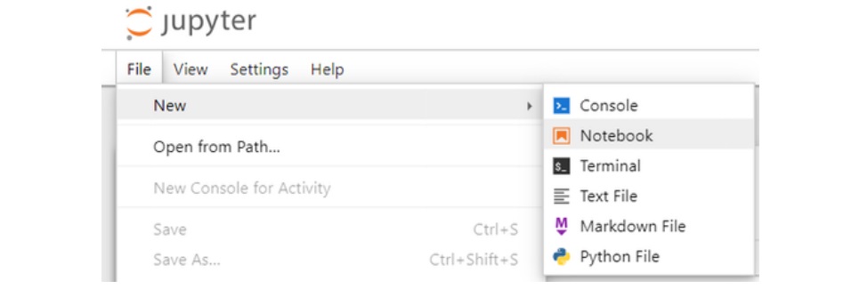
For this project, I used Jupyter Notebook as my Integrated Development Environment (IDE). It is simple yet effective and allows you to write and run code in blocks, which saves time when working with data visualization. You can install Jupyter Notebook by following the installation instructions on their website. After installation, you can run it using the command:
jupyter notebookThis command will open a local instance of Jupyter Notebook in your browser. On the main screen, press the "New" button at the top and select "Notebook" to start writing your code.
Once that is done, you will be presented with a new screen. At this stage you can start putting the code inside the "Block".
What I like about Jupyter Notebook is that you can add code and divide it with separate blocks. At the start, the code is being run from top block to the bottom block, but during development you can go back and re-run specific blocks as needed. This is handy when you want to introduce more data points or files for data visualization and you don't want to re-run the code that hasn't changed.
Using appropriate buttons at the top you can always restart the whole notebook and re-run the blocks from top to bottom, or just restart a current specific selected block.
First, we need to import the required libraries:
import matplotlib.pyplot as pltThis command imports the Matplotlib library, which we will use to create our visualizations.
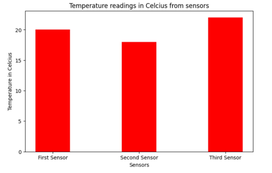
Next, we will take a look at a simple Bar Chart example using hard-coded data values. After this example, we will import and define a dataset from a CSV file.
data = {'First Sensor': 20, 'Second Sensor': 18, 'Third Sensor': 22}
readings = list(data.keys())
values = list(data.values())

fig = plt.figure(figsize=(10, 5))
plt.bar(readings, values, color='red', width=0.4)
plt.xlabel("Sensors")
plt.ylabel("Temperature in Celsius")
plt.title("Temperature Readings in Celsius from Sensors")
plt.show()
The first declaration that we do is we declare the data dictionary which uses key-value pairs, for example we declare the "First Sensor" reading and assign it a value of 20. This data will later on be replaced by a CSV file.
readings = list(data.keys())This part of the code retrieves all keys from the data dictionary and converts them into a list named readings.
values = list(data.values())This part of the code retrieves all values from the data dictionary (the temperature readings) and converts them into a list named values.
fig = plt.figure(figsize=(10, 5))This part of the code initializes a new "figure" (graph) for plotting and assigns it to a variable fig. The figsize is where you can change the size of the graph (width, height) in inches.
plt.bar(readings, values, color='red', width=0.4)This part of the code actually creates the Bar Chart using the readings and values. You can also set the color and the width of the bars themselves.
plt.xlabel("Sensors")
plt.ylabel("Temperature in Celsius")
This is where you set the descriptions of the x and y labels, x label being on the horizontal axis, and y label being on the vertical axis. It is good to define them so that everyone that sees the Bar Chart can understand it more easily.
plt.title("Temperature Readings in Celsius from Sensors")
plt.show()
The last two commands add a title to the Bar Chart and display it on the screen.
If everything worked out right, you should see the following Bar Chart on your screen.
Now we can use a custom CSV file to do the exact same Bar Chart with the exact same values. I have the following CSV file with me:
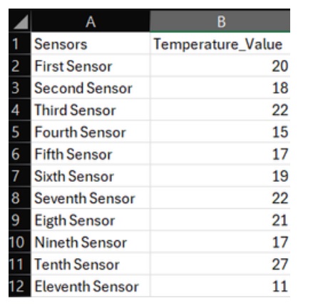
Now having this data, I saved it as a CSV file and imported it into the "main screen" of Jupyter Notebook, which is in the localhost:8888/tree web page. (You can import the CSV file inside the main page of Jupyter Notebook or you can link the file location from your own computer as well; in this case, I chose the first option as it is easier.)
Once the file is in the right place, all you need to do is go back to the code snippet from before and change how we declare and reference the data. We also need to import a new library to use.
import pandas as pdAbove is the new library that we need to import; you can put this into the first block where we imported the previous Matplotlib library.
The following is the updated code:
df = pd.read_csv('sensor_temperature_data.csv')
# The above is the updated code where we declare and reference the CSV file.

readings = list(df.iloc[:, 0])
values = list(df.iloc[:, 1])
# The above two lines of code are different also; we need to reference the data, [:, 0]
# being the first column in the CSV file, and [:, 1] being the second.

fig = plt.figure(figsize=(8, 5))

plt.bar(readings, values, color='red', width=0.4)

plt.xlabel("Sensors")
plt.ylabel("Temperature in Celsius")
plt.title("Temperature Readings in Celsius from Sensors")
plt.show()
With the above code, you should see a new, more detailed Bar Chart as before, but now this time we are using the data from a CSV file.
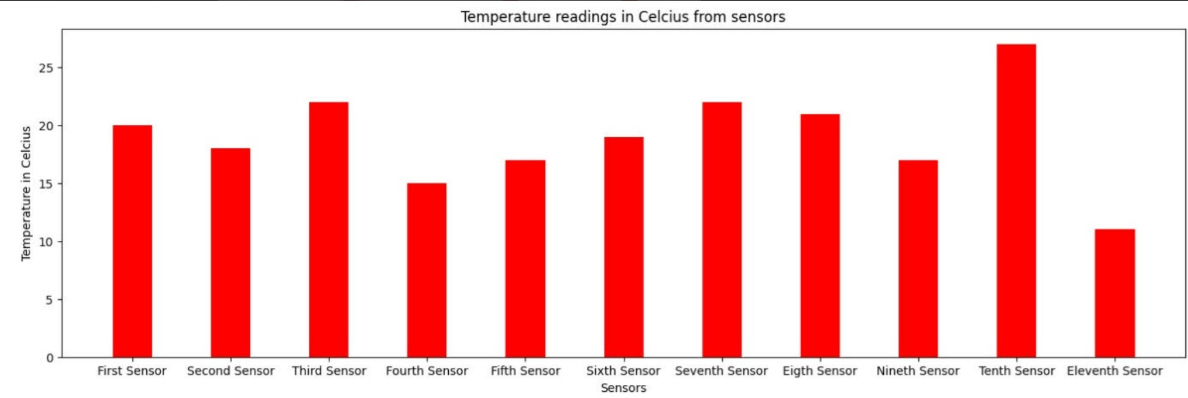
You can see how this way of dealing with data is more efficient, as you do not need to declare the data by hand, and you can work with a predefined data file that has a larger amount of data.
Any other not listed visualization graphs can be found on the official Matplotlib website.
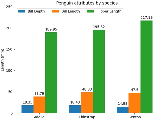
For example, you can create grouped bar charts to compare multiple datasets side by side. Here's an example from the Matplotlib documentation:
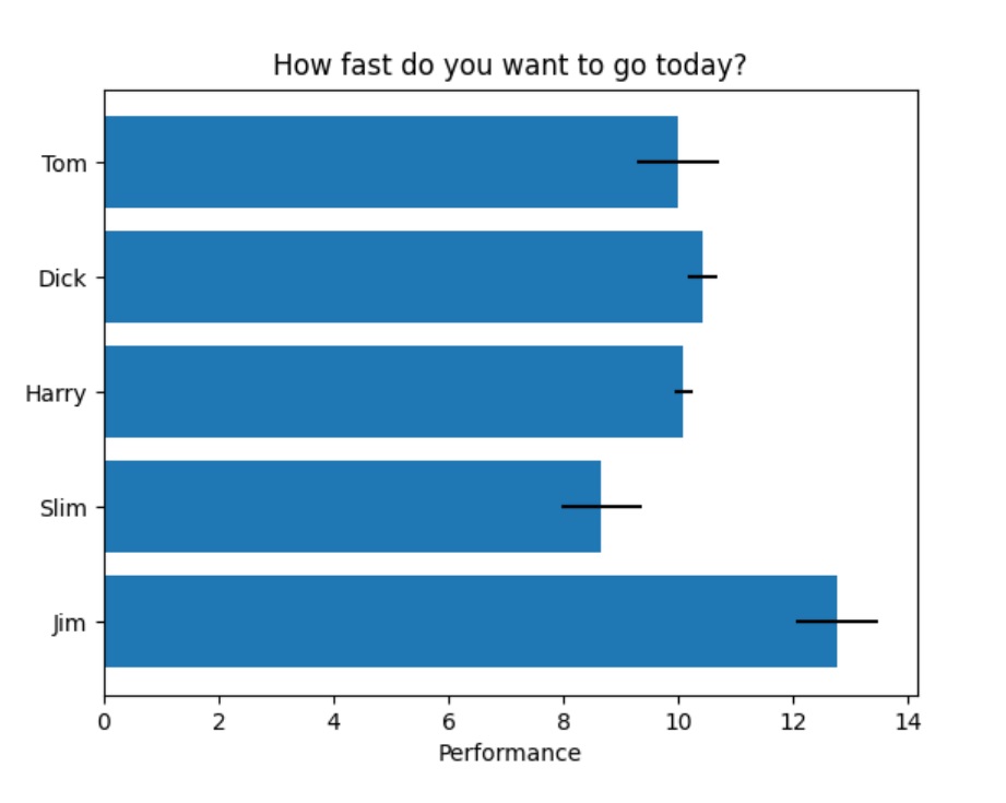
You can also create horizontal bar charts, which can be useful for displaying data where labels are long or for stylistic preferences. Here's an example from the Matplotlib documentation:
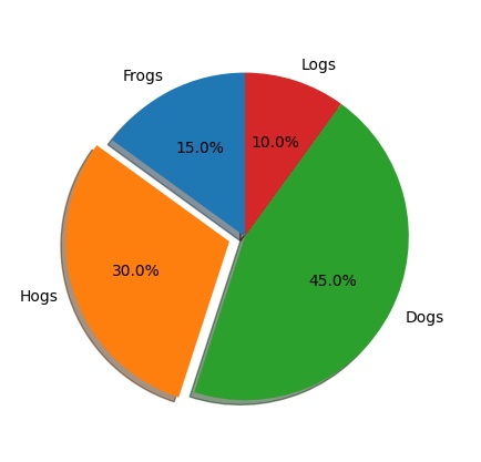
Pie charts are another way to visualize data, especially when you're interested in showing proportions or percentages. Here's an example from the Matplotlib documentation:
Just before I finish this blog page, I will show one linear point graph from my report. In this graph, you can see the comparison between two sensors and their data in the 24-hour period when the testing was done. This graph was used to look at the values closer and compare if there were any major deviations between the two data sets.
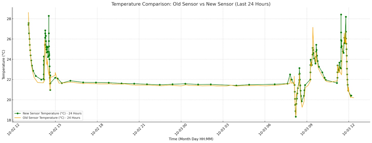
By looking at this graph, we can tell that there is no major difference in reported temperature value between the two tested sensors.
I think using Matplotlib to show complex data from large CSV files is really important. It helps us understand a lot of information quickly by turning numbers or other data into clear graphs and charts. This makes it easier to see patterns and trends in the data. Plus, Matplotlib is flexible, so we can create different types of visuals based on what we need, whether it's simple graphs such as a bar chart, or more detailed and in-depth graphs. This makes it a great tool for looking at data and sharing our findings with others, or using the findings for data reports.